City Gospel Mission
Merging a House of Brands Into a Branded House
The Challenge
City Ministries served as the umbrella brand for two nonprofits: City Gospel Mission and CityCURE. Founded in 1924 by James Gamble of Procter & Gamble, City Gospel Mission provided food and shelter for the homeless and recovery programs. CityCURE provided a variety of tutoring and mentoring programs for at-risk youth.
In order to eliminate confusion caused by several other mergers and acquisitions, multiple brands, and layers of programs, City Ministries desired a branding strategy that would address the following concerns:
- If they should continue to operate under an umbrella brand or merge
- How this change would affect the names and structures of their programs
- What the branding architecture would look like
- How it would shape the website and print materials

The logo of the former umbrella brand, City Ministries

The former City Gospel Mission logo

The former CityCURE logo
The Strategy
An extensive brand analysis was conducted for City Ministries, City Gospel Mission and CityCURE. The qualitative and quantitative evaluation of their internal and external audiences included:
- Focus groups with board members, staff and volunteers of City Gospel Mission and CityCURE
- A web-based cultural audit survey that was distributed to board members, staff and volunteers of City Gospel Mission and CityCURE
- In-depth phone interviews with community and religious leaders
- A web-based brand awareness survey that was distributed to CityCURE donors, City Gospel Mission donors and the general public
The Solution
After testing several new names, data indicated that City Gospel Mission owned the attribute of “Christian outreach services.” City Gospel Mission also had higher brand awareness than City Ministries and CityCURE, but the CityCURE logo was ranked the most memorable. Therefore, we decided on a strategy that took the best of both organizations to signal a new beginning while also showing respect to history. The organization merged under City Gospel Mission and adopted the dove from the CityCURE logo. Deliverables included:
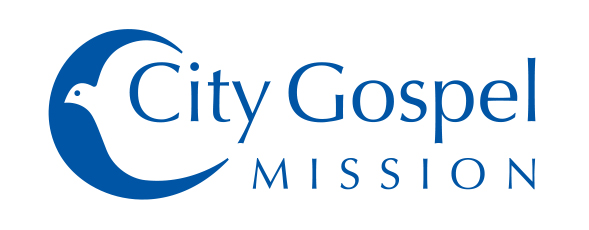
- A new logo that combined the “City Gospel Mission” name with the dove of the CityCURE logo
- A branding manual with guidelines for the brand personality and brand essence, mission statement, logo size and safe space requirements, color palette, fonts, branding architecture, and subsystems for programs and units
- A six-month internal and external communication plan for the rollout of the new brand

The new City Gospel Mission logo after the merger